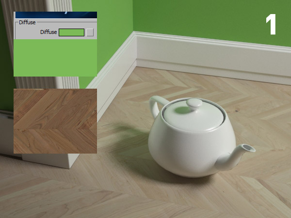
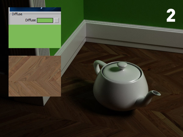
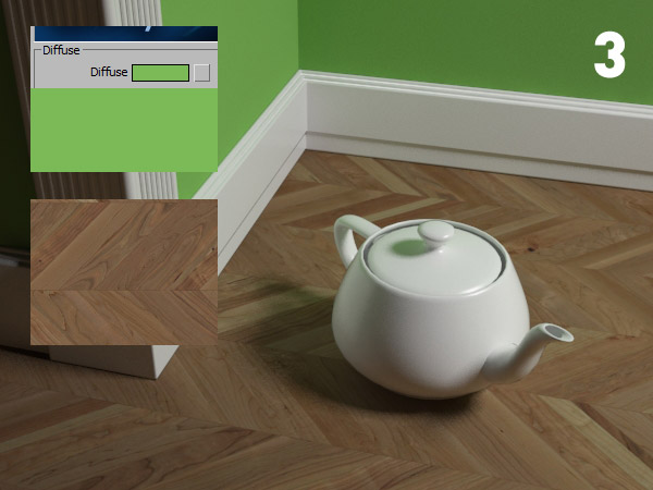
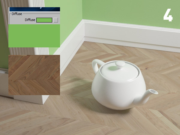
We can evaluate “at a glance” if gamma compensation is correctly applied ?
When working with the visual disciplines (and others) we constantly tune the shot based on what we see during the process. It’s a continuous action-reaction and in the end much of the success comes from the ability to react correctly to stimuli.
The singers, musicians, successful athletes are all able to properly evaluate their own results, to correct from time to time effectively, being so more and more perfected.
Ok Ciro.. what is this bullshit on self-assessment today?
The point is that if we can effectively evaluate our outcomes – including the gamma correction application – then we can ‘react’ and correct any errors. The problem is not wrong, but do not realize it!
Regardless of how and where it is applied the gamma in our software, we can train to estimate the functioning of this compensation from a couple of objective information.
TWO OBJECTIVE DATAS:
this GREEN is the color that will put in the “diffuse” of the wall, and this is the TEXTURE (as it appears in the windows photo viewer ), I’ll put in the “diffuse” of the floor:

According to what is written in MY BOOK, that from the PREVIOUS POST it should already be clear how, where and why gamma is applicable. For this post we shift the focus exclusively on its results. We can assess whether the gamma has been applied correctly, knowing the color and texture objectively?
All images that follow have a problem, except but one! To make everything clear and I put “references” in every attempt.
No matter how  cases 1,2,3 and 4 were generated. Think only the image and estimate it at a glance: The colors roughly correspond or is there an evident difference in brightness?


As you may have already guessed the image number 3 is the correct one.
Certainly changing light and exposure colors can change I’m not looking for perfect match. But the point is that when something is wrong with gamma, the difference is so noticeable! The colors and textures litterally “jump” on another level of brightness!
The analysis is made on the images thus is independent from the software. Then, of course, any software can have its ways to implement gamma correction for which the solutions to the problems can vary. But identifying the problem is universal.
What if these images was relized with Max + V-Ray?
Here a brief analysis
IMG 1)Â Gamma applied to render and to the texture as well! The texture is already “gamma corrected” at birth as it is a photo, so if you apply a second correction the result will be washed out.
IMG 2)Â Excessively saturated colors, dark and contrasting? It is recognized on the fly: we have completely forgotten the gamma.
IMG 3)Â Yay! Correct correspondence between color, texture and render: gamma applied correctly! 🙂
IMG 4)Â The render is washed out after saving? You probably have the gamma in color mapping (OK!) but you have gamma 2.2 to “output” (in preferences), so when you save it will be added an additional 2.2 gamma.
So, from now on .. if a co-worker shows you a render with some gamma-disease, simply take a couple of objective references and be the expert! Let me know how it goes … you owe me a beer now! 🙂
Happy render,
Ciro Sannino
PS In “3ds max 2014”, everything is simplified thanks to the automatic recognition of the gamma, I will tell you something when vray for 2014 will be on the market! Anyway, as educator I prefere articulate a post with more  variables: it helps to highlight the concepts and make it universal.
 / Also Learn Corona Renderer


Excellent!!! thank you very much for the tips, very well explained and clarified some doubts I left I had seen other tutorials on the net.
You are great again! Thank you!
Absolutely informative, i could never figure out why the images where so washed out, thanks Ciro, i definately owe you a beer!