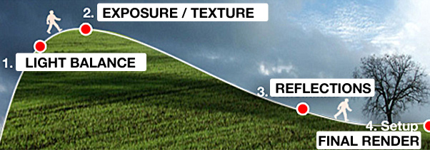
When I work on a rendering I apply a personal workflow. It’s nothing secret or special, but it’s helpful to me and for every person who was in my trainings. I usually have 4 steps. They help me to keep track control the evolution of the work:
- Balance of Lights (with default material)
- Exposure correction (after the application of texture)
- Adding reflections (Glossy and not glossy)
- Final rendering setup
I figure out these 4 steps as a hill to climb:

A very hard start, a point of verification, and finally an easier way down.
The start is brief, artistic and complex. The conclusion is longer, technical and easier.
The 1st step it’s “only” about putting lights in the scene. You have to decide the primary light and consequently add the secondary lights, fill lights and so on. I usually use the V-Ray default material  (equivalent to Kodak 18% gray).
This is - from a technical point of view - the easiest step. There are few parameters to control, but it is artistically the most complex step. This step is really hard for the people who are very good with the only parameters! Yes, because the “parameter control” is not the main topic at this step. The most important topic is the way the lights are related to each other: Light Balance. Artistical people are advantaged.
A great light balance make the image “more” 3D! It creates volumes and depth in the image. A bad light balance make everything flat.
The light balance is the foundation of the image, if the foundation is not strong the building is always in danger. But if the foundation is great you can add materials, backgrounds, lights, you can play with the parameters: the result will be always fine.
Here my advice: make sure that the light balance works fine before proceeding. Try also the second step (adding textures), sometimes the colors help the contrast, but never go over if the image does not work! In my experience as trainer I know the problems in 90%  is in the beginning: light balance.
Everyone knows: good morning starts in the morning.
*

Check the videotutorial, donwload a sample scene a repeat the exercise.
Learn how to model a scene using the lights.
[private Premium|Premium1|Premium-1year]
VIDEO SUMMARY:
- Use multiplier to create volumes with lights
- Use Color Temperature to create cold-warm contrasts
- Create different scenarios
The most important thing is keep in mind the hearchy of lights. Here a Light balance analysis:
Every light has a specific role (primary, secondary, fill) – (click to magnify )
EXERCISE:
- Download the scene here and try to balance lights like in the video.
You can use V-Ray Real Time or a low setting for irradiance map.
The final result it’s the same, just the time changes.
For any doubts check the “FINAL” to see a balance example.
[/private]
*
EXAMPLE: from Francesco Romanucci (student) – Light balance is OK! – (Â click to magnify )
*
In the following Final render, Francesco just added materials: lighting is the same – (Â click to magnify )
CONCLUDING
As you can see, the illumination in the two images has the same distribution. After complete the light balance, just add the materials and the render is finished in brief! My students knows that the shading is not so complicated: 1 day leargning. That is not the problem: The crucial point is the light balance.
No parameters can help you, just your imagination.
 / Also Learn Corona Renderer


This is very insightful – thanks
hi, ciro
thanks
One of the smallest tutorial that can make the largest impact on rendering quality. Simply great. Thanks a ton for the tutorial.
hi,
this is nice tutorial.If you have time,pls share using of vray sphere and vray plain light in interior design!
More over their useage,disadv&adv..etc..thk 😉
Thanks great secret… Hope to see more.
waaaaaaaaaaaaaaaaaaaaaa…. cOOL..!!!!!!!!!!!!!!!!!!
hi
thanks
i love ur tips…thanks a lot..!
thanks friend for your copration
path to success
thk U Broo,
hi thanks
I always enjoy your posts. Keep them coming!
Wonderful, these are great tips. I’ve just started sculpting in 3D and have become addicted. I’ll be following your posts from now on.
My first sculpture is now on my blog, I chose to try and model the character of J F Sebastian from the film Bladerunner. Environments and machinery are next on my to do list.
awesome !!!!
nice pic
I like it,tanks
this is good tutorial but i want full tutorial of v ray
Hey Ciro!
Thanks very much for this, especially the diagram. Super helpful.
I see that you also do an exterior lighting setup using Guthrie’s HDRI/exr files – if you have time, a tutorial dealing with mixing the two together would be really appreciated!
I have a lot of trouble balancing an interior lighting scheme that has exterior light (guthrie hdri’s) spilling in through large windows.
best!
very nice tnx
how was the rendering setup?
Hi Holake,
i didn’t noted it because “rendering setup” was not the focus of this post 😉
hi ciro
i just want to thank you for spending time in writing your tutorials! i just get it! i have always been apprehensive about learning the ropes properly to develop a nice quality render, and with your help I hope I hope to become more courageous and adventurous.
hope you’ll have an english running workshop in europe soon! thank you!
Hi Stuwy…
thank you so much for your words! 🙂
Ciro.
Thanks Ciro,
That was really helpful.
However there is one thing that I quite don’t understand. In vray manual for radiant power it says that 100w light bulb only produces 2 or 3 watts of visible light and we shouldn’t make a mistake about it but in this tutorial your student used 80w planes. Could you elaborate?
When I use these settings I get nice results for planes but not for the ies lights. Is there something that I miss? By the way I used vray sun in the scene. I believe I make mistakes with the intensities of the lights because I can never achieve a good light balance.
Hi swarthykhan,
first of all it’s all about balacing, not watts. It means that 2 lights could be 5 and 10 watts OR 3000 and 6000 watts that’s the same in terms of balance. Definitely the same.
About IES the measure units in ‘power’ option is “candles”, for this reason you need to start 120000-150000.
But the most important thing is balancing you “see”, not the measure units. Using correctly te watts can help you, but that’s not the point.
Thank you for your kind, informative and swift answer, Ciro.
Most people on the tutorials emphasize the importance of world units and I get that and may be that is the reason I deviate from the main point. This is 3d after all. We are allowed to do anything and nobody cares how we do it as long as the output is fine.
hi ciro,
thank you very much for this wonderful tip about lighting. Please post tutorials regarding interior lighting in vray incl rendering, it will help me to understand interior lighting much better.
its amazing we waiting it to be downloadable
hi!
very good!
hello ciro,
I saw your reply to swarthykhan and you said that the measure units in power for IES is in candles.
Well…when I us some IES lights from lighting companies which provide its IES lights through their sites, I notic that when I insert an IES light and go to the parth of the IES in order to indicate it, automatically the power units field is filled with its value, for example 7500. I also noticed that this number, most of the times is the lumens value of the light.
Have you ever notice something like this, or is it something I did not understand it in the wright way?
Hi VIKOUM,
I underline is in candles becasue many people say me “ohh woooo 7500 is it too much?!” – So I just say don’t care the number, just increase it until you have the light you want. This will not break photorealistic rules. (the most important thing!!)
Hi Ciro, how´re doing? Great tutorials, thanks for sharing.
I found a little confuse that you made the fill light behind the sofa simulate the tv, am I right or I misunderstood it? What do you think of putting a vray light in front of tv to do the job, would it be a silly solution?
Cheers.
Hi Frederyco,
the fill light behind the sofa “could” be a tv… but also fire or whatever you want, since it’s not in the shot. In case your tv is IN the shot I hardly suggest to use VrayLightMtl, with a tv screenshot as texture. It works perfectly.
Thanks for this tutorials!
just amazing man tnx